
The Hidden Struggles
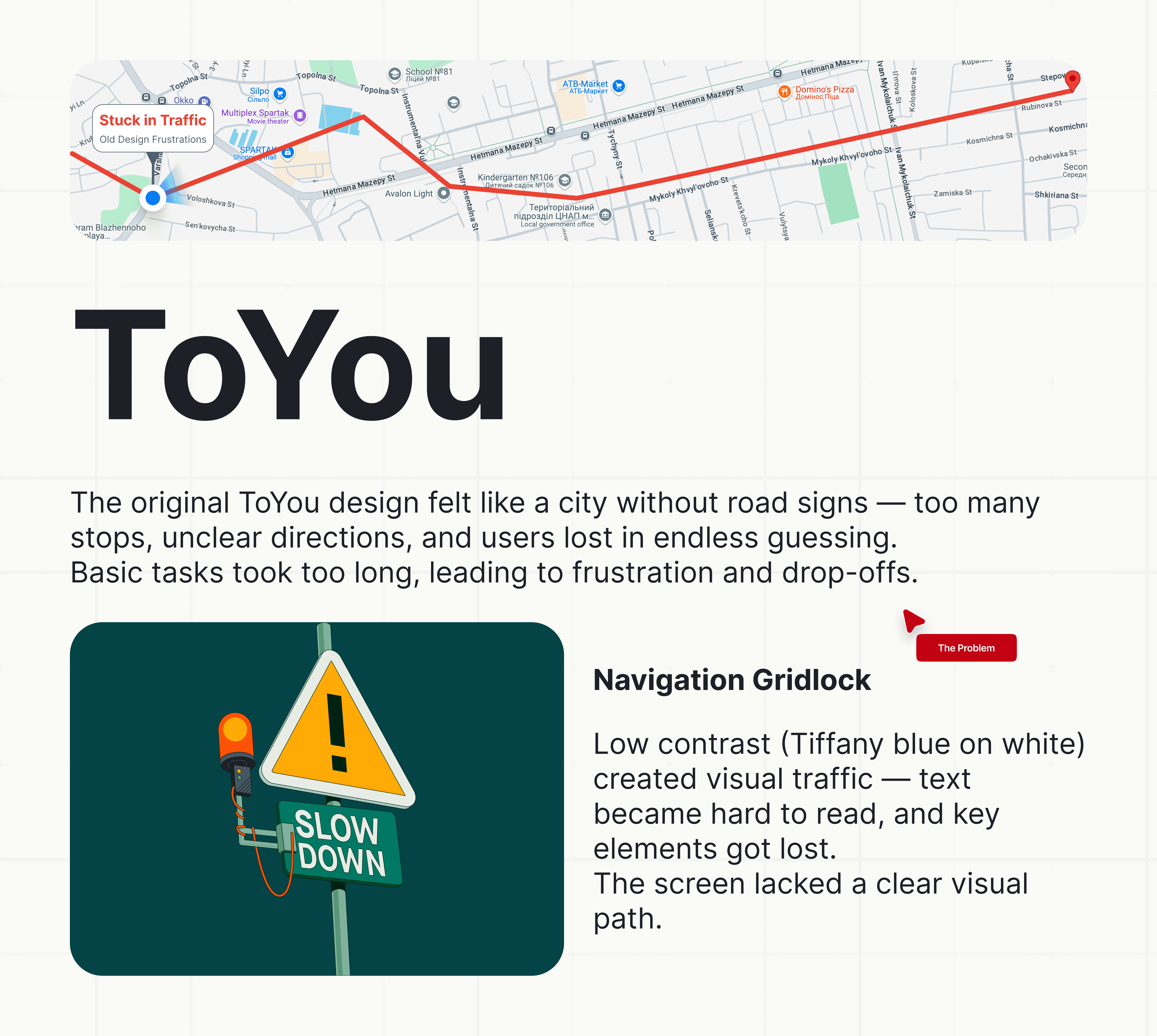
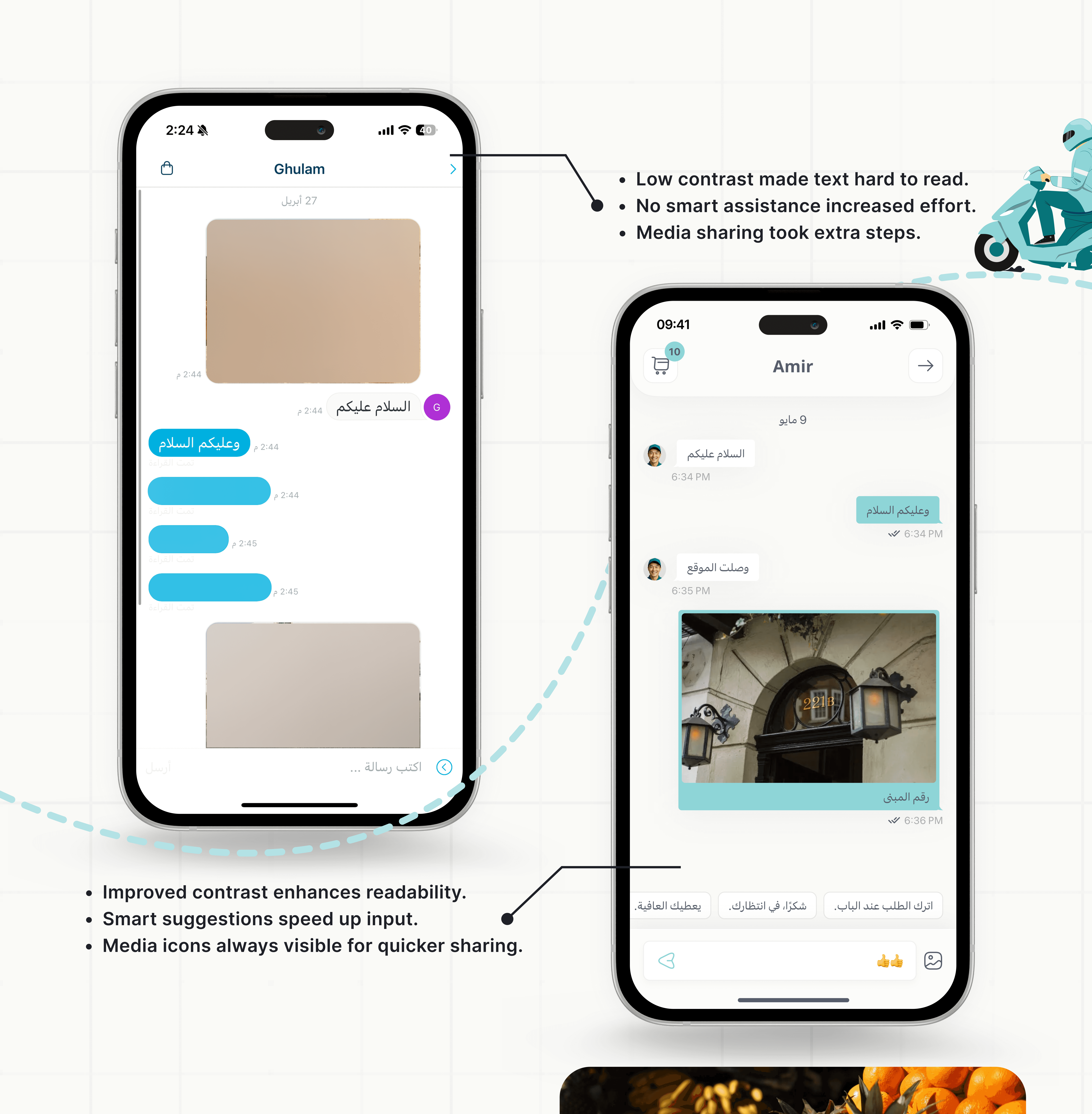
Low contrast made content difficult to read
Screens lacked structure and direction
Essential features were buried deep in the flow
Repetitive actions slowed down the experience
Confusing steps caused drop-offs and frustration
Crafted Solutions
Stronger contrast for better visibility
Clear hierarchy to guide attention
Key actions brought forward
Fewer steps for common tasks
Unified design patterns across screens


Results & Impact
Faster task completion
Clearer paths across the entire journey
Higher user satisfaction during testing
Interface now feels cohesive and intuitive
Key Takeaways
Clarity removes hesitation
Fewer decisions create smoother flow
Contrast isn't just visual — it's functional
Simplicity is a result of deliberate design